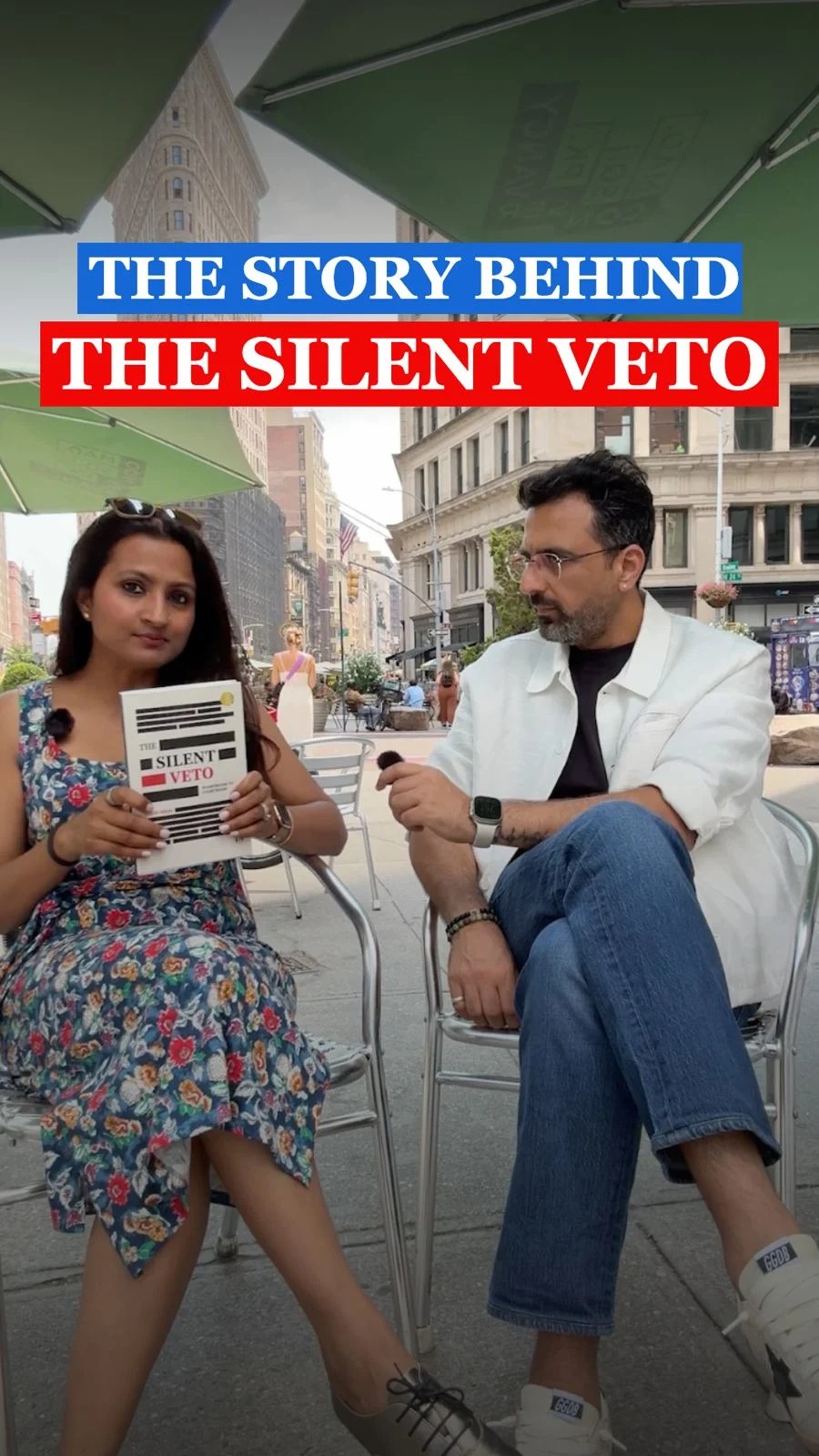
Why the best cover for a book about hidden conversations almost says nothing at all.
When I finished writing The Silent Veto, I assumed the hardest part was behind me. The manuscript had been written, rewritten, challenged and refined over months. The ideas had settled. The arguments had become sharper. The stories had found their place. All that remained was the cover.
Like most authors today, I turned to AI. Within hours I had dozens of concepts. Venn diagrams. Boardrooms. Legal metaphors. Partnerships. Conflict. One design in particular became my favourite because it appeared to communicate everything I wanted the reader to understand before opening the book.
I sent those concepts to designer Kris. She looked at them for a few moments and rejected my favourite almost immediately. Not because it was poorly designed. Because, as she later explained, it was trying to do the wrong job.
“A book cover isn’t supposed to tell the story,” Kris told me. “That’s what your book does. The goal of a cover is to stop the reader, make them think, create curiosity and then let the book deliver the story.”
That single sentence completely changed my understanding of design. Until then I believed the cover was a summary. Kris believed it should be an invitation.
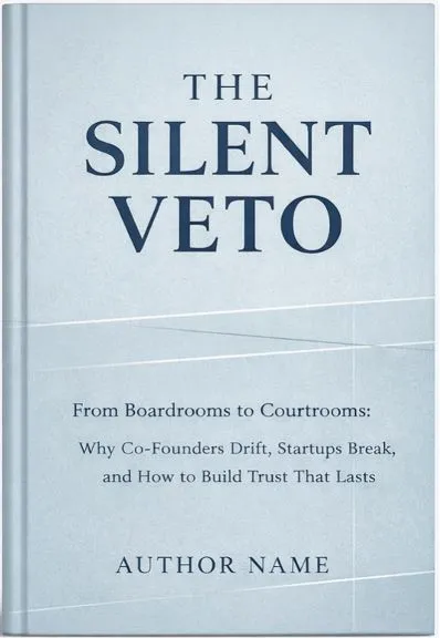
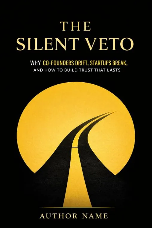
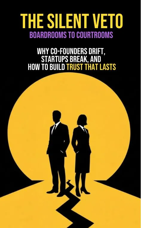
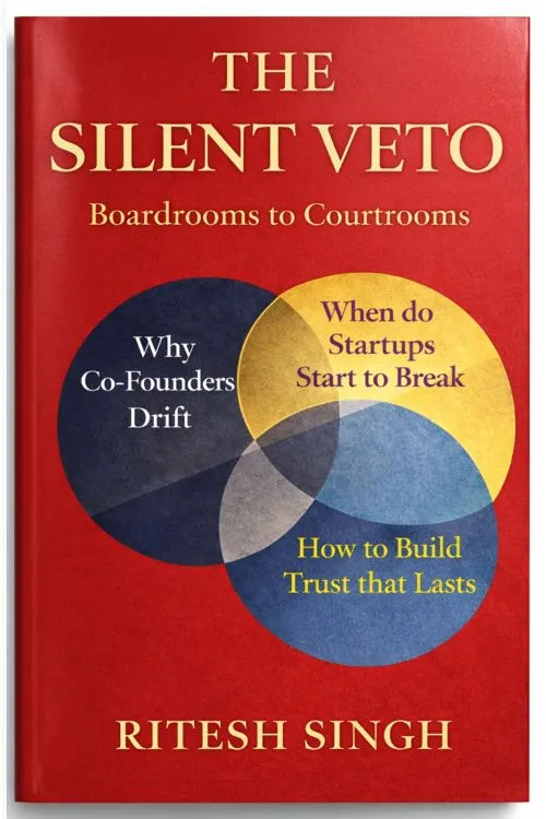
One of the most memorable ideas Kris shared was something designers casually call 'monkey ideas'. The first ideas that come to mind are usually surface-level solutions. They are necessary because they clear the obvious from the table. Only after you have exhausted them do deeper ideas emerge.
In retrospect, AI was invaluable because it accelerated this elimination process. It wasn't replacing design thinking. It was helping us move through the first layer faster.
Kris began her process by deciding what not to do. Chessboards. Confidential stamps. Silhouettes. Legal clichés. Every one of them communicated the category, but none of them created intrigue. They looked familiar because readers had already seen them hundreds of times.
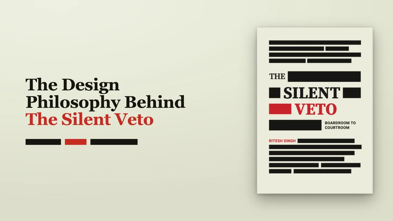
Then came the breakthrough: redaction.
Black bars on legal documents immediately trigger curiosity. We know information exists beneath them. We just can't see it. That psychological tension mirrors the central argument of The Silent Veto. The most consequential decisions inside organisations are often the ones that are never openly spoken.
“The cover had to say something by not saying it,” Kris wrote while reflecting on the project. “A redacted page makes you lean in. You start trying to fill in the blanks yourself. That is exactly what happens between co-founders.”
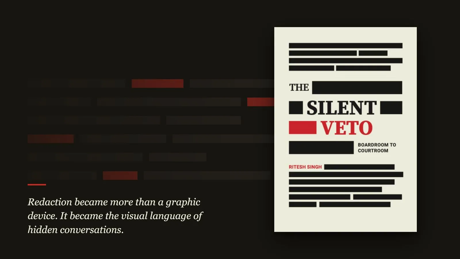
Once the central idea was established, every other design decision became an exercise in restraint. The background became the colour of aged legal paper rather than stark white. The palette was reduced to cream, black and red. The typography deliberately avoided fashionable choices. Georgia brought seriousness instead of style.
“This cover got better every time I took something away,” Kris reflected. “The instinct is always to add. Another visual. Another texture. Another typographic move. But this project kept rewarding restraint. Say less. Trust the reader. The blank space is doing more work than you think.”
I realised that Kris hadn't rejected my design. She had challenged my assumption. I believed clarity came from explaining more. She believed clarity often comes from removing everything that distracts from the central idea.
That lesson extends far beyond book covers. It applies to leadership, presentations, writing and strategy. We often mistake more information for more clarity. Yet the most memorable ideas are rarely the loudest ones. They leave room for the audience to think.
The final cover of The Silent Veto doesn't summarise the book. It embodies it. It invites the reader into a mystery before asking them to confront one of the most overlooked dynamics in business partnerships: the conversations that never happen.