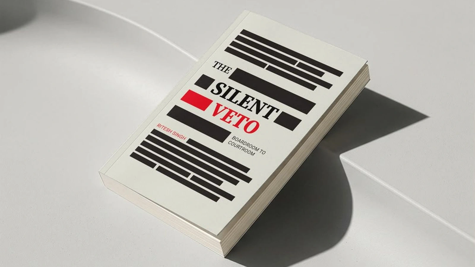
Designing the cover of The Silent Veto taught me why restraint is the hardest creative skill.
When people ask about a book cover, they usually want to know about colours, typography or inspiration. Those questions are important, but they come surprisingly late in my process. The first question I ask is much simpler: what should this design refuse to do?
When Ritesh first shared The Silent Veto, he also shared several AI-generated cover concepts. They were thoughtful and surprisingly useful. They explored themes of partnership, conflict and governance. Conceptually they worked. But they also did what first ideas usually do, they explained the problem before inviting anyone to experience it.
Designers sometimes joke about 'monkey ideas', the first obvious solutions that arrive when you begin thinking. They are necessary because they clear the surface. Only after you move beyond them do more original ideas emerge. AI helped us move through that first layer very quickly.
“The first ideas are monkey ideas.”
Once I stopped looking at the cover as a summary of the book, the direction became clearer. A book cover is not responsible for telling the story. Its job is to stop a reader, create intrigue and earn permission for the story to begin.
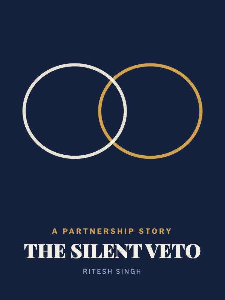
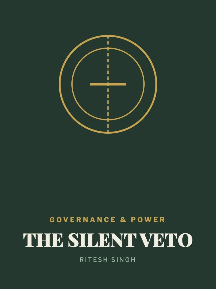
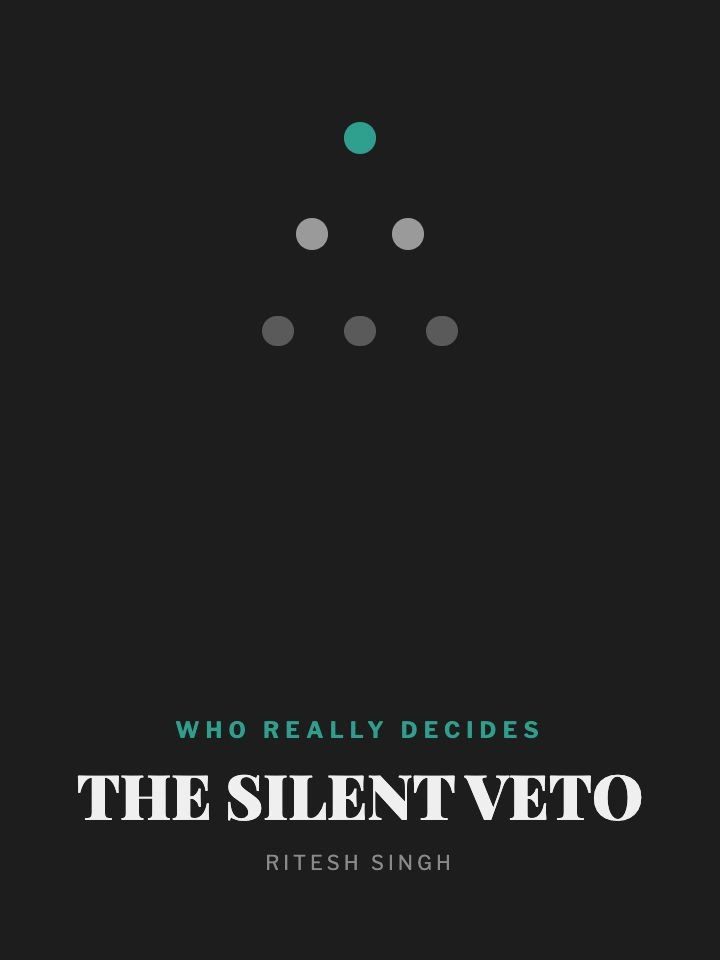
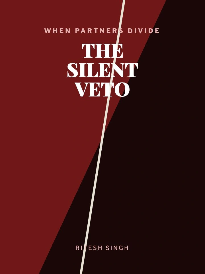
The word I kept returning to was 'unsaid'. The book is about conversations that never happen, authority that is never openly exercised and decisions that quietly reshape relationships. I wanted the cover to communicate that same feeling without illustrating it literally.
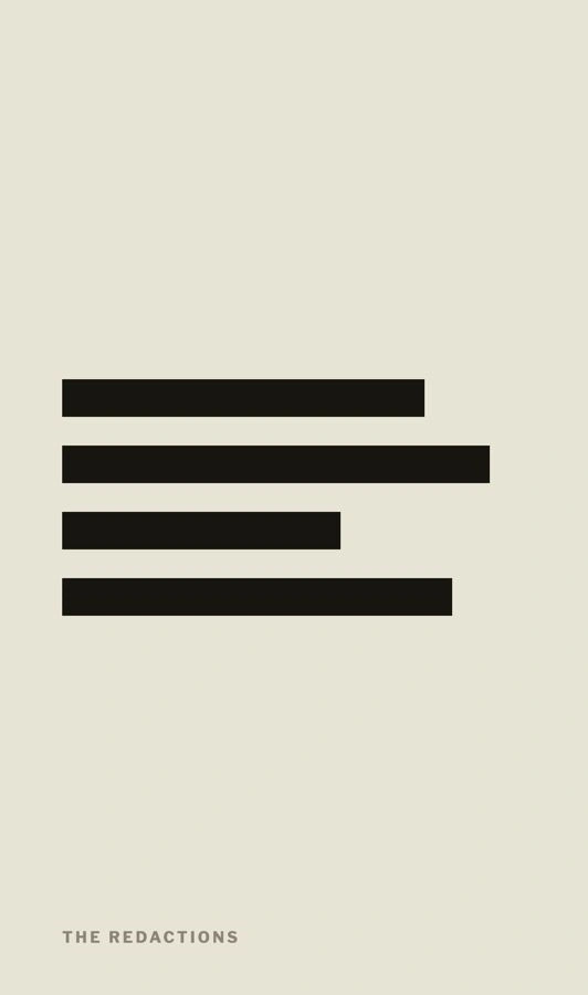
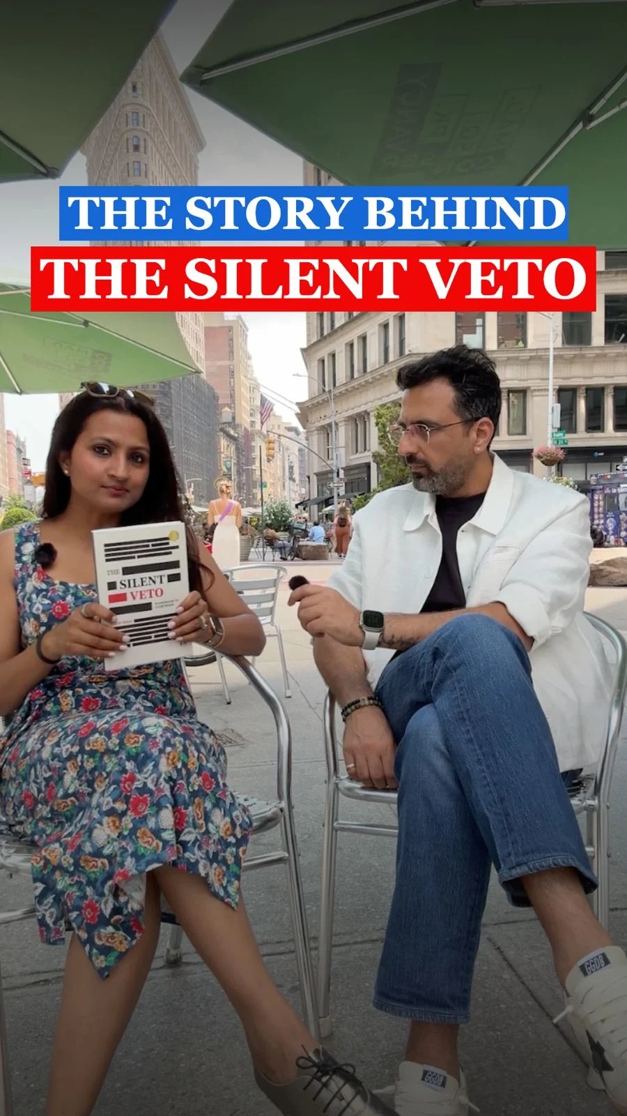
That is why redaction became the central idea. A redacted document immediately tells you that something important exists beneath the surface. The information has not disappeared; it has simply been withheld. The instinctive reaction is to fill in the blanks yourself. That emotional response felt remarkably close to what happens inside organisations when communication begins to fail.
I deliberately kept the redactions literal rather than stylised. The visual language belongs to legal filings, court documents and official records, the same world the book inhabits as it moves from boardrooms to courtrooms.
“A book cover isn't supposed to tell the story. The book does that.”
Every decision after that became an exercise in restraint. The paper became warm cream instead of stark white because I wanted it to feel like an old legal document rather than a clinical sheet of paper. The palette stayed limited to cream, black and red. Restriction creates focus.
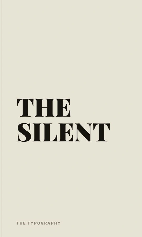
Typography followed the same principle. I chose Georgia because it carries weight without drawing attention to itself. Serious subjects rarely need expressive typography. They need typography that quietly earns trust.
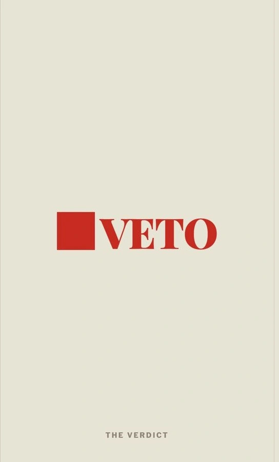
Red appears only where it matters most. The word VETO needed to interrupt the page. It had to feel decisive, almost like a legal stamp or a final verdict. Everything else exists to support that moment rather than compete with it.
The biggest lesson this project reinforced was that design often improves through subtraction. Under pressure, the instinct is to add another texture, another visual cue or another explanation. This cover became stronger every time something disappeared.
“This cover got better every time I took something away.”
That lesson extends well beyond book covers. The best products, brands, interfaces and identities are rarely the ones that say the most. They are the ones that know exactly what to leave unsaid.
The cover of The Silent Veto is intentionally quiet. It doesn't attempt to explain the book before you open it. It simply asks a question and trusts the reader enough to search for the answer. For me, that trust is where good design begins.
“Say less. Trust the reader. The blank space is doing more work than you think.”
Kris is the Founder of Glass Half Full, an independent design studio. She previously worked in advertising, at IDEO and Google, where she led to shape digital products used by millions.